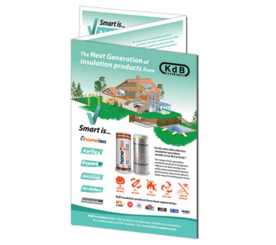
Your new business venture is finally complete, you’ve spent countless hours and had many sleepless nights but the end is finally in sight. But with many other business out there offering a similar service/product how will you stand out and more importantly how will people get to know about your new business? Whether you’re a seasoned entrepreneur or a first timer, the time-tested flyer can be one of the most effective ways to raise brand awareness. We’ve created a handy guide to help you create the perfect.
The Importance of a Flyer
Before you go all guns blazing into designing your flyer, ask yourself two questions, “Why do I need a flyer?” and “Where will I distribute them?” These may sound patronisingly obvious, but you would be surprised how few people ask these questions. They allow you to focus of your businesses key message and your audience this will guide your approach to the copy, call to actions and design.
Get Your Wording Right
We are sure that your business is great and we know how tempting is it to include lots of information on your flyer but this can seriously impact your flyer success. You need to focus on supporting one message and prompt your flyer readers to take one clear action.
You decide on what your copy needs to say, we recommend that you start with a simple task of distinguishing the ‘five Ws’, the five Ws are as follows, who, what , when, where and why of your product or service. Try to write a few sentences for each of the five Ws and then it down to around 50 words making sure you keep focus on the main message you want to portray, include key selling points to entice your readers.
50 words may sound a little scary especially when you could write a book on how great your business is but 50 words is an easily digestible level of information, perfect for people who may pick up your flyer on the go.
Attention! Call To Action
Once you’ve perfected your incredibly enticing sales pitch you flyer readers will want to know more, how, where and when and this is exactly the reaction you want from you flyers. To get your readers to take the next step you need to have a call to action on your flyer, and this is where the most amount of focus is needed, if you forget this you may as well rip your flyers up. Call to action’s can be as simple as ‘Visit us in store’, ‘Follow us on Twitter’ or ‘Call us today’, it really is as easy as that, just a few words to guide your customers in the right direction. If you really want to up the ante you can add a little incentive such as a promotional offer ‘quote FLYER to receive 10% off your first order’.
Delightful Design
Now for the fun part – the secret is to not get carried away with the design, remember ‘less is more’ the design needs to work and support with your flyer content and call to action. We recommend following a few basic guidelines to achieve flyer design perfection: use a maximum of three fonts or font sizes and use one prioritised image to draw readers in.
Your flyer must represent your company’s existing branding, consistency is key in effective marketing as customers will start recognising your company and its branding, especially if you flyer is asking readers to visit your store or website. Synergy between a company’s branding and marketing materials oozes professionalism.
When it comes to choosing your main images Need A Print’s design templates allow for show stopping images so why not use this to your advantage? The image needs to relate to your flyers content and your company.
There are many other ways in which you can increase the likeliness of your flyer standing out – a square flyer can make your flyer a little different as most flyers are of a rectangular shape. Need A Print offer a number of different designs and styles to ensure your flyer is recognisably better than the rest.
Hopefully this advice has got you focussed on why your business would benefit from flyering and how your flyer could generate more sales for you business all you need to do is get your creative hat on and start designing!
